Giant Branding

INDUSTRY
Charity, Design Agency

ROLE
Branding, Visual Design, Animation

OUTCOME
A well-executed visual brand for Giant Giving will enhance the platform’s appeal, increase user engagement, and strengthen its presence across social media channels, ultimately driving more donations and support for charities.
OVERVIEW
Giant Giving is a platform that enhances charitable donations. The focus here was on creating a strong visual brand identity, including colors, typography, animations, and social media advertising.
ideation
Whilst eploring different ways to express the four pillars visually I came up with some strong marks that are easy to understand and stand out well.

FURTHER DEVELOPMENT
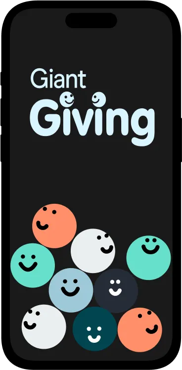
The logo mark I selected for further development is Giant Giving. Using a rounded font for Giving and integrating the Giant Digital logo typeface  allows the Giant Digital brand to be represented within the logo lockup.Anthropomorphising the dots above the I’s helps give the typeface an even more friendly feel.
Typography & Colour
Using the same fonts as the logo marks creates a cohesive look and feel across campaigns. The full Giant Digital colour palette has also been put to use, allowing for nice pops of colour and an exciting feel to visuals.
ideation
Whilst eploring different ways to express the four pillars visually I came up with some strong marks that are easy to understand and stand out well.
Main concept for the animation:
We introduce the Giant Digital brand, then animate  one of the four pillars underneath it, Giant Giving. By visualising the balls swirling and collating to form the logo mark we are visualising the  optimised fundraising and engagement offered by the platform.
Facebook, X, Instagram, Social : Create visually appealing posts that tell compelling stories, share success stories, and highlight ongoing campaigns.
Stories and reels: Use short, engaging videos to capture attention and convey messages quickly and effectively.